The world’s leading architects and interior designers recognise that colour is far more than a finishing touch. It is a critical design discipline that influences experience, supports function, and brings ideas to life. The Creative Colour Awards celebrate those who demonstrate exceptional mastery of colour in the built environment. Entries are evaluated not on visual impact alone, but on the depth of the colour narrative: how hue, tone, and finish were deployed to serve the design’s social, emotional, and environmental intent.
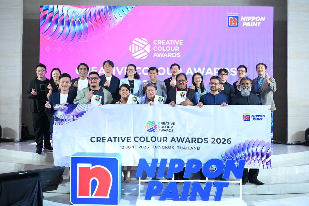
Now in its fourth edition, the Creative Colour Awards 2026 took centre stage in Bangkok, Thailand, held concurrently with the AYDA International Awards 2025/2026 as part of Nippon Paint’s celebration of a spectrum of excellence, where the architectural, interior design, and creative colour worlds converge onto a single, prestigious global stage. Together, the CCA and AYDA Awards represent Nippon Paint’s belief that design and colour are inseparable forces. The breadth of this interwoven relationship deserves greater appreciation and celebration, from the ambitions of the next generation to the mastery of today’s leading practitioners.
The celebration brought together the architecture and interior design industry’s most distinguished voices, including Christina Thean, Principal Partner at Park + Associates; Ekaphap Duangkaew, Founder and Director at EKAR Architects; Hideji Kanamori, CCD Tokyo Representative and Global Managing Partner at Cheng Chung Design (Tokyo); and returning jury members Lai Siew Hong, Chief Executive Designer at Blu Water Studio, and Francesca Heathcote Sapey, Partner and Managing Director at Teresa Sapey + Partners. Their collective rigour ensured that recognition at CCA 2026 carries meaningful industry weight.
CCA 2026 received 257 submissions from 16 countries and geographic locations—a continued demonstration of the growing recognition of colour not merely as an aesthetic consideration but as a core element of design thinking.
The exceptional calibre of submissions received this year prompted the jury to make the decision not to confer a Grand Prix Winner for 2026, as each project demonstrated a distinctive and equally compelling approach to the purposeful use of colour. Instead, the Creative Colour Awards 2026 recognised outstanding colour-led design across five specialist categories, honouring the diverse range of spaces in which colour can define, transform, and elevate the human experience.
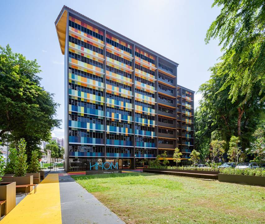
OWAA Architects LLP from Singapore earned the Architectural Best in Corporate and Commercial Exterior award for HHOM – Nurse Hostel. This project transformed a former 10-storey school building into a 250-bed nurses’ hostel. In this project, colour was used to reflect the diversity of nurses’ uniforms in Singapore, each distinguished by different sleeve, collar, and button colours. The result is a vibrant expression of unity, symbolising the coming together of nurses from different races, nationalities, religions, and cultures working in Singapore.
Meanwhile, Türkiye’s KONTRA took home the Interior Design Best in Corporate and Commercial Interior award for Epoca. Designed for a young and energetic audience, Epoca draws inspiration from the rich and layered culture of Latin America—its warmth, colour, rhythm, and deeply rooted traditions of communal gathering. The primary design goal was to create a venue that harmonises with the mall’s architectural language while standing out through its distinctive façade and outdoor bar area. Featuring a soft yet harmonious colour palette, the design establishes a presence that is both immediately recognisable and memorable.
In the Architectural Best in Residential Exterior category, Flo by Sansiri Public Company Limited from Thailand was recognised for its condominium development in Bangkok’s vibrant Khlong San district. The project draws inspiration from the area’s historical identity, where brick was once a dominant building material. This heritage is thoughtfully translated into the development’s signature brick-orange palette, which serves as its defining visual identity.
Kaizen Architecture from Singapore earned the Interior Design Best in Residential Interior award for Matou House, an additions-and-alterations project for an existing semi-detached residence. In Matou House, colour is used as an architectural device to define the spatial and emotional core of the home. A terracotta-red stairwell void anchors the house vertically, intensifying its chapel-like proportions and transforming functional circulation into an emotional experience. Set against a neutral palette that allows daylight and greenery to dominate the living areas, the red volume establishes hierarchy and orientation, elevating colour into a powerful tool that shapes movement, perception, and the experience of domestic space.
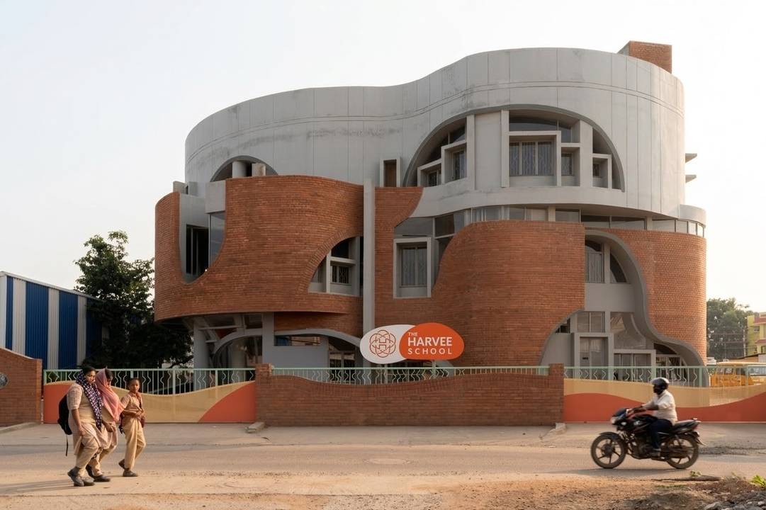
Finally, Murali Architects from India, returning contender and CCA 2025’s Grand Prix winner, was honoured with the Best in Public Spaces award for The Harvee School in Kuniyamuthur. Colour was used to shape how children perceive and navigate space, with vibrant hues of blue, coral, yellow, and green animating classrooms, corridors, and the central staircase, transforming everyday circulation into playful landscapes. The staircase serves as a colourful spine that guides movement across levels, while bold window frames punctuate the façade with rhythm and identity. Balanced by the warmth of the brick façade, the palette creates a joyful yet grounded environment that encourages curiosity, comfort, and discovery among young learners.
The apex of artistry: celebrating creative colour excellence
In its four years, the Creative Colour Awards has established itself as the definitive standard for colour excellence in spatial design—a platform that the architecture and interior design industry can look to as a benchmark for what purposeful, innovative use of colour can and should achieve. While broader design competitions evaluate colour as one consideration among many, the Creative Colour Awards were built on the belief that colour, when deployed with genuine intent, is a design discipline in its own right, and deserves a platform that judges it as such.
Through the rigour of its judging criteria, the calibre of its jury, and the global diversity of its entries, CCA has positioned Nippon Paint at the forefront of a growing industry-wide conversation: that colour is central to great design, and is capable of redefining how communities inhabit, experience, and find meaning in the spaces and facades around them.
This year, that rigour was evident across the full range of submissions; from exterior facades that used colour to preserve heritage and historical narratives, to interior environments that used colour to blur the boundaries between surface and space. The diversity of entries, spanning 16 countries and geographical locations across residential, commercial, and public space typologies, reflects how universally colour speaks, and how differently it can be made to say something meaningful.
"The Creative Colour Awards celebrate those who understand the transformative power of colour. We believe colour is not merely seen; it is experienced, interpreted, and strategically applied to shape the spaces and facades around us. By shining a global spotlight on excellence in colour design, CCA continues to raise the bar for the industry. This year’s entries are an inspiring reminder of how far the discipline has progressed and the exciting future that lies ahead," said Jo-Lynn Yap, Senior Manager, Group Colour Leadership, NIPSEA Group.
"I am particularly pleased to see the Creative Colour Awards take place in Thailand this year. Thailand’s rich cultural heritage reflects the enduring power of colour, from its architecture and craftsmanship to its vibrant festivals and public spaces, making it a fitting backdrop for a platform dedicated to colour excellence. It is encouraging to see designers using colour with intention to shape experiences, express identity, and create more meaningful connections between people and place," said CCA jury Ekaphap Duangkaew, Founder and Director, EKAR Architects.
Francesca Heathcote Sapey, Partner and Managing Director at Teresa Sapey + Partners and returning jury member, also emphasised, "Historically, colour has always shaped how civilisations express identity. It is a cultural force, not an embellishment. The most compelling submissions this year were not those where colour was applied last. They were the ones where colour was part of the thinking from the very beginning. That is the bar CCA is setting, and the industry is rising to meet it."
“Good colour is not about making something look interesting. It is about creating a particular feeling, reinforcing an idea, or helping people connect with a place. Like materials, light and proportion, colour is part of the architectural language,” said CCA jury Christina Thean, Principal Partner, Park + Associates. “The projects recognised by the Creative Colour Awards demonstrate how colour can move beyond decoration and become a fundamental part of the spatial experience.”
Fellow jury Hideji Kanamori, Global Managing Partner and Executive Vice President, Cheng Chung Design (CCD) TOKYO enthused, “As a juror, beautiful is never enough—colour must solve. When colour helps people intuitively understand a space and remember it meaningfully, it moves from surface to substance. That is what separates the outstanding submissions from the rest, and that is the standard CCA holds the industry to.”
For more information on the Creative Colour Awards, visit www.creativecolourawards.com.


